Podcast Summarization
Previously: Podcast Vibes Presentation.
Text summarization is a fundamentally a creative act, at its best preserving the essence of the original work. Writing is selection, and summarization doubly so. This came to mind today while I was exploring designs for a user interface to substitute for the experience of listening to a podcast.
This is a chronicle of the first hour or so of that exploration, playing around with a transcript from this recent interview.
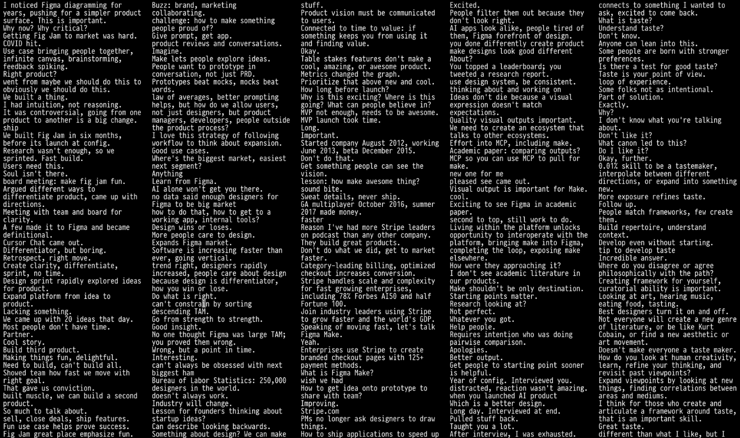
At first I wanted to see whether I could simply avoid summarization altogether by avoiding line breaks and using a full-width display, but there’s quite a lot of text in a transcript, so this doesn’t work even with a relatively compact font.
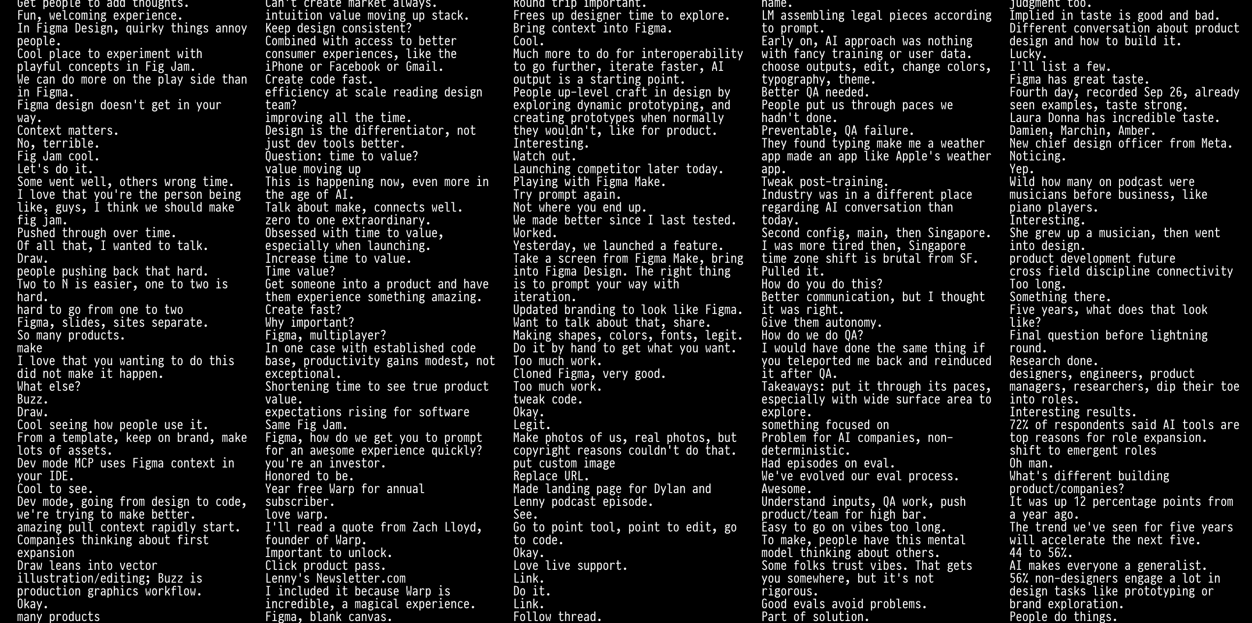
So I tried columns instead:
Wrapping the text in columns felt a lot better since I could now move my gaze in a smaller region of space to read a complete thought. But there’s still just too much text.
So I experimented with asking an LLM to take individual sentences and omit unnecessary words.
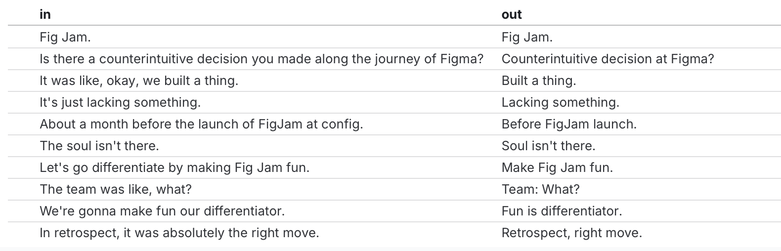
Here it is for the whole transcript. Not very useful! But interesting…
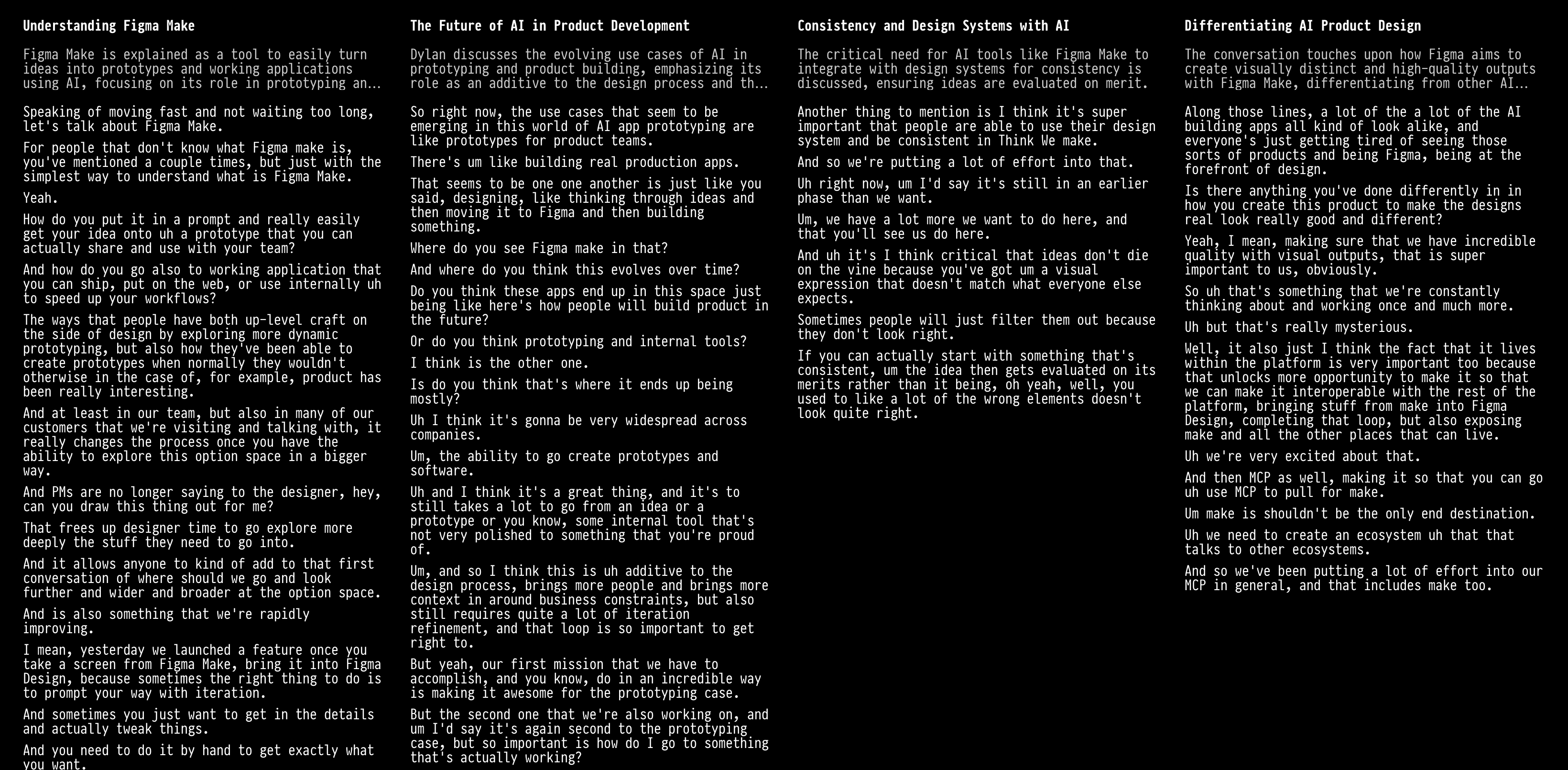
I used an LLM to split the transcript into topics, and then give each topic a title and description.

I was initially resisting using an LLM for topic identification because it felt like handing over a lot of power to the system, but the result is much more easily scannable. You can look across the top row to get a sense of conversation, then dive in by scanning down.
A fun idea to evaluate how easily auditable an AI-powered user interface is might be to use adversarial prompts that generate misleading summaries with some probability, in order to see whether I would notice. Can the cognitive cost of spot checks be made low?
Same design with slightly wider columns:
It could be interesting to identify conversational dependencies between transcript sections and use that to enable something like program slicing, but for meaning. An example of this idea in a different context is Flowistry – imagine being able to click on a topic or sentence to cut down the conversation to the subset of “related” discussion (presumably with some kind of soft relatendess cutoff).
Future work:
- Use a change of color or font to differentiate LLM-generated from original source text.
- Identify speakers and allow toggling the presence of individual conversational participants.
- Try view-aware topic-splitting, where if a topic is too long for the current display, adaptively partition it into subtopics with the goal of maximizing the usage of screen space.
- Rather than on topic per column, explore a grid with fixed-height scrollable cells or a masonry layout.
- How could this generalize to visualizing a set of thematically overlapping podcasts with the same guests (eg. 3-10 podcasts of the same author on a podcast media tour)?
- Are there principles from story structure that we could use to structure the presentation of the text?
- This project is forcing me to confront squarely the question of what exactly it is that one gets from a podcast. It’s clearly not just factual information: there’s also emotion, allusion, and subtext. What matters?
Further reading: